


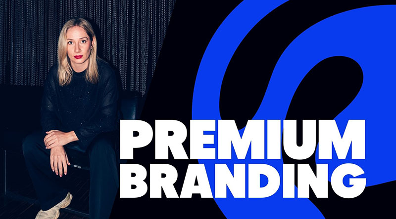
WHAT MAKES APPLE'S BRANDING SO PREMIUM
Hey there!
"We want to look as premium as Apple" – you can't imagine how often I've heard that in my 10+ years as a freelance designer.
So, let's break it down.
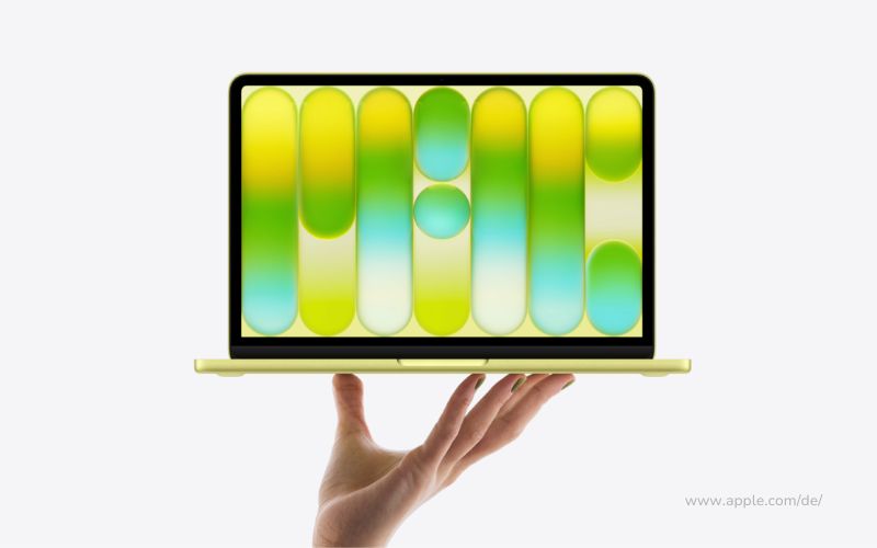
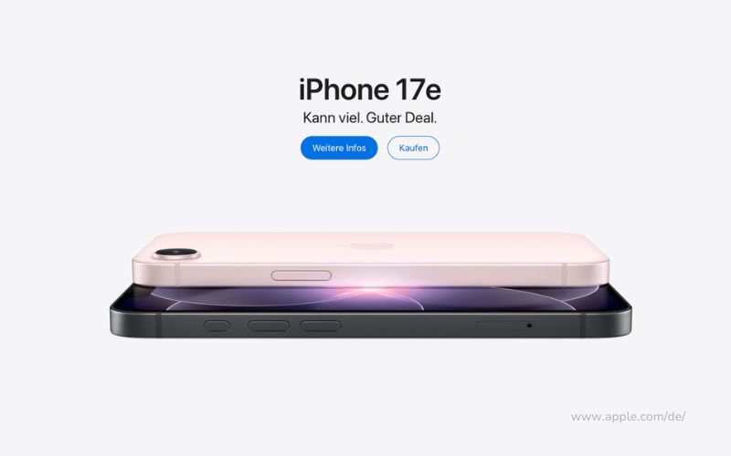
Apple doesn't use much color. But when it does, it's strategic.
A red button. A gold iPhone. Black and white all around it.
And suddenly, everything looks high-end.

THE PSYCHOLOGY BEHIND IT:
Luxury brands are showing less, not more.
Chanel. Rolex. Porsche. Apple.
Why does this work?
→ High-contrast elements get 23% more clicks*
→ Colorful designs attract 42% more attention* – but too much can be overwhelming
→ Apple does the opposite: black and white. The product provides the color.
Your eye is naturally drawn to wherever there is color.
WHY LESS = MORE EXPENSIVE:
People associate clutter with cheapness.
1-Euro-Shop:
Packed to the brim. Lots of colors. Lots of text.
Apple Store:
Clean. White. Products spaced apart. Almost empty.
That is visual hierarchy as a branding tool.
Premium brands communicate through omission:
- Fewer colors = more focused
- Less text = more confidence
- More white space = more exclusive
Apple's website: No clutter. No distractions.
Just: Product. Price. Button.
BUT: THIS DOESN'T WORK FOR EVERY BRAND
Let's be real: Minimalism isn't a one-size-fits-all solution.
When it is NOT appropriate:
❌ Innocent Drinks
Colorful packaging. Playful illustrations. Lots of humorous text.
→ Minimalism would make them look sterile
❌ Festivals (Tomorrowland, Coachella)
An explosion of color. Maximalist designs. Chaos as a concept.
→ Energy and excitement are part of the experience
❌ Your brand, if:
- You thrive on energy and chaos (streetwear, youth brands)
- Your product requires a lot of explanation (complex SaaS tools)
- Your target audience expects playfulness (kids' products, fun brands)
- You want to be deliberately anti-premium (discount brands)
The question isn't, "Should I be minimalist?"
But rather: "Does minimalism fit my brand personality?"
WHAT YOU CAN LEARN:
✅ White space gives your design breathing room
✅ High contrast performs 23% better than many colors
✅ Let your product or CTA provide the color, not your entire design
✅ Minimalism = confidence ("Our product speaks for itself")
Important: This isn't right for every brand. But when it is—it can be a game-changer.

SELF-CHECK:
✅ Does my website look clean—or cluttered?
✅ Am I using white space strategically?
✅ Is my design focused—or is it distracting?
✅ Does minimalism fit my brand personality?
Hesitated more than twice? Maybe it's time for a redesign.
My two cents
Premium isn't about price. Premium is a feeling.
And this feeling is created by design choices:
What you show. And above all: what you leave out.
Apple gets it: "Less is more" isn't just a catchphrase. It's a strategy. 🔥
But only if it fits your brand.
See you next week – design with intention, not decoration.
Chantalle
P.S. – If your website looks more "cluttered" than "premium" right now: Let's talk about it. Sometimes all it takes is a few strategic cuts. ✉️ chantalle@boredbrands.studio
