


You shouldn't look like everyone else. And color plays a big role in this.
Hey Brand fan,
Let's be honest: when you scroll through your industry, how many brands actually look suspiciously similar?
Cosmetics = Beige.
Tech = Blue.
Food = Green.
Coaching = Terracotta.
Yes, these colors work.
But that's exactly why everyone does it. And that's the problem.
If everyone looks the same, no one really stands out—and your brand identity gets lost in the crowd.

🧠 Colors have an immediate emotional impact.
We're not talking about a little decoration here.
Colors trigger emotions—in milliseconds.
🔵 Blue stands for trust
🟢 Green stands for naturalness
🔴 Red stands for energy
⚫ Black stands for elegance
🟡 Yellow stands for attention
But: If you choose the same color scheme as everyone else, you'll end up in the same box—even if you're actually completely different.
What you can do instead
1. Don't ask yourself what your industry is doing. Ask yourself what you want to achieve.
Do you want to calm people down? Motivate them? Inspire them?
Then choose colors that convey that message—not the ones stuck on your competitors' mood boards.
2. Combine more cleverly. – Chantalle's top tip
You don't have to throw everything out right away.
Sometimes a twist is enough: a familiar shade – paired with a striking accent color – can have a completely different effect.
3. Break out of the mold—but with a plan.
Simply being "different" isn't enough.
You need colors that stand out and suit you.
💡 Would you like an example?
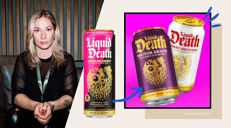
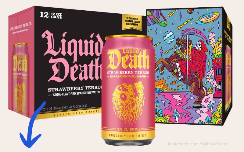
🥤 Liquid Death
Liquid Death comes in a black can with a skull.
And suddenly you want to order water as if it were heavy metal.
Why does it work?
- The color breaks completely with the market
- It suits the target group (skateboarding, music, edgy culture).
- And it turns a no-brainer into a statement
🎁 Another option?
Think about it:
Wouldn't it be smarter to package your product in your target group's favorite color—instead of the color your competitor has been using since 2013?
Colors don't work in isolation. They live in interaction.
Especially in social media or on packaging, what counts is whether you get stuck in the scroll stream.
When everything is pastel, a strong contrast can be the game changer.
Or the other way around: when everything is loud, sometimes quiet wins.
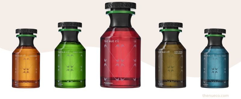
💡 Example: The Nue Co. (Supplements)
Instead of Health-in-Green: dark brown, clear typography, calm look.
The result? It feels more like a design brand than cheap supplements—and that's exactly why it sticks in your mind.

✨ What you can take away with you
- Colors are emotion, not just pretty
- Courage pays off—if it suits you
- If you want to stand out, you can't look like everyone else.
🏁 Conclusion
Branding does not mean: color XY, because everyone else is using it.
Branding means: choosing a color that speaks for you.
One that triggers something. One that stays with you.
So:
Away from cookie-cutter designs.
Toward color with impact.
See you next week—stay bold, stay visible, stay true to yourself.
And if you have any questions or are unsure whether your color really suits you: Write to me 🙂
Chantalle
