


Stop selling yourself short
Hey there!
Scroll through your Instagram for a moment. Then take a look at Graza's. Then back to yours.
Do you notice?
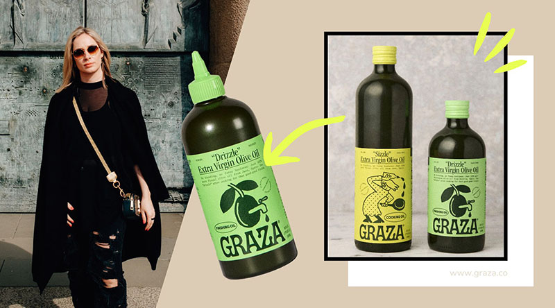
Graza sells premium olive oil from Spain. Single origin. Extra virgin. But not in fancy glass bottles with gold foil.
But in squeeze bottles. Like ketchup.
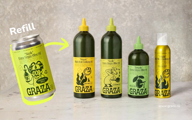
Matte green plastic bottles with hand-drawn illustrations, retro typography, playful copy.
"Drizzle" and "Sizzle" instead of "Estate Reserve Limited Edition."
Result? From launch straight to Whole Foods, Target, Walmart. Over 100K in the first week.
Because they understood that a premium product does not always need premium packaging. It needs the right packaging for the target group. 🔥
You? Looks like five different brands that couldn't agree.
Real talk: that's costing you sales.

Not pretty enough ≠ The problem
Your branding doesn't have to be "pretty." It has to fit with what you stand for.
Graza could have made it easy: a stylish glass bottle, Mediterranean design, artisanal handcrafted vibes.
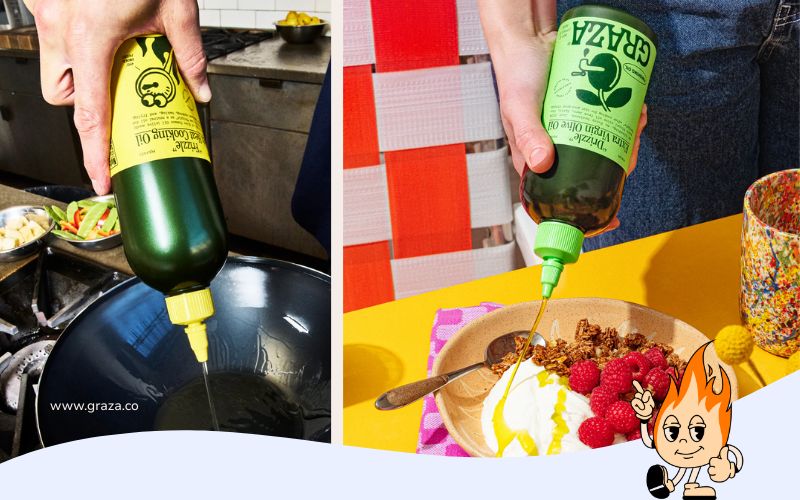
Instead: Squeeze Bottle. Because their mission is to get people to use their oil—not let it gather dust in the cupboard.
Stop worrying about wasting the good stuff.
Your packaging is your message. Your illustrations are playful because cooking should be fun. Your typography is retro-European because it's Spanish oil—but without fake heraldry.
All in all: a brand identity that tells you who they are at first glance.
Now look at your product.
Are you asking for $50 but look like you're worth $5? Then you don't have a sales problem. You have a trust problem.
Last year: Food startup with us. Awesome product, $25 per unit. Website? Canva template. Instagram? Random fonts, random colors.
I asked, "Would you buy it—just based on how it looks?"
Silence.
Three months later: New branding. Clear visual identity. Packaging that tells their story. 300% more conversions.
Not because the product had improved. Because they finally looked the way they wanted to look.
When is the switch due?
You already know.
✅ You scroll through the competition and think, "Damn, they look better."
✅ Your team designs random stuff—zero consistency.
✅ You want higher prices—but your branding screams "budget."
✅ Someone asks, "What do you stand for?" and visually there is no answer.
Truth? If even one of these points applies to you, then your branding is holding you back.
And every day you wait, others pass you by. 🔥
My two cents
"Good enough for now" is the most expensive decision in the long run.
Branding is not a nice-to-have. It's the difference between "interesting" and "I'll buy that right now."
The question is not: Can I afford professional branding? The question is: Can I afford NOT to have it?
See you next week—get your sh!t together!
Chantalle
P.S. – Graza in squeeze bottles vs. your feed. What does your branding say about you? 👀
