


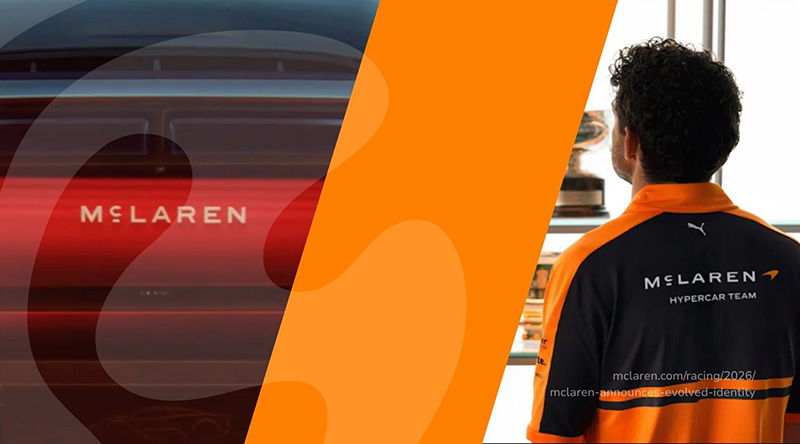
New Branding, Same Old Backlash: Why Fans Always Complain at First
Hey Brand fan,
If you've ever done a rebranding, you probably know the drill: You launch the new logo, you're super stoked, and some of the first reactions are... let's just say, not exactly enthusiastic. 🫠
Welcome to the club! It's McLaren's turn now , and they've actually done a lot of things right.
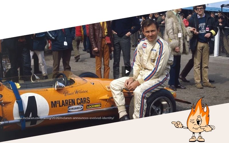
McLaren: Back to its roots, yet still facing headwinds
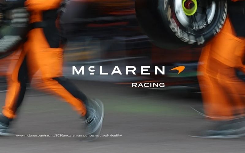
On September 22, McLaren unveiled its new brand identity, which will now apply to both its racing and sports car divisions. The new wordmark is based on the hand-painted sign above Bruce McLaren’s parents’ gas station in Auckland, New Zealand, where it all began. It’s accompanied by a custom typeface called McLaren Sans, featuring straight uppercase letters instead of the slanted “Speed” look, and a small stroke under the “C.” Papaya orange remains, as does the Speedmark—though the latter now plays only a supporting role.
Fans find it boring; others say it looks like a coffee shop, a fashion label, or a hotel loyalty card. Even Tom Foulkes, who served as McLaren’s Global Head of Brand until 2025, has publicly voiced criticism: “I don’t think the objections are really about a logo.” He believes fans are more concerned that racing is no longer the focus at McLaren.
And that's exactly where it gets interesting—just take a look at Jaguar. 👀
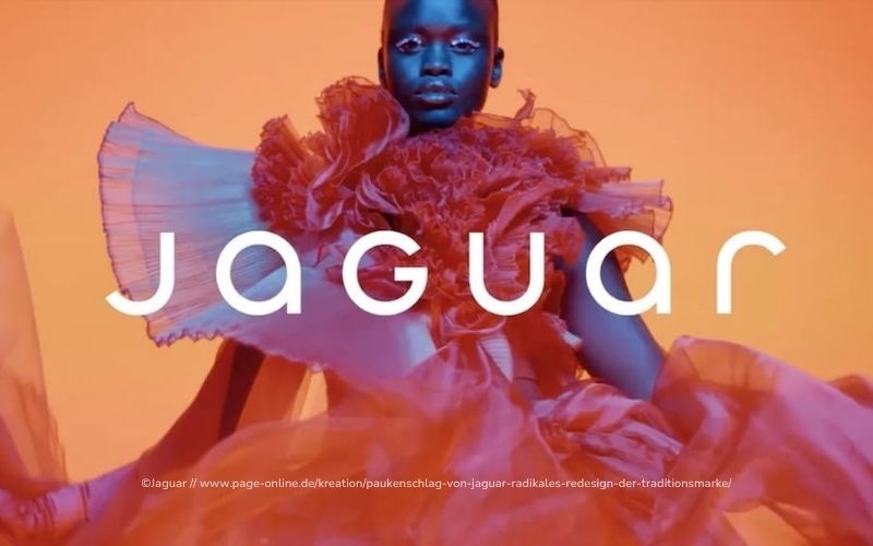
Jaguar: Everything Gone, Everything New
Just a quick reminder: In November 2024, Jaguar removed the big cat from its logo, introduced a completely new wordmark, and launched the “Copy Nothing” ad. The backlash was massive, and the internet made fun of it for weeks.
In August, former Chief Creative Officer Gerry McGovern admitted that Jaguar had canceled planned communications due to the public reaction. However, Jaguar is sticking to its original plan: the new cars are set to arrive in 2026, and production of the old models has been halted until then.
The big difference compared to McLaren: Jaguar left virtually everything that fans associated with the brand behind, and then didn't unveil a new car for ages. So for a long time, there was nothing between the logo and the product that people could latch onto.
Apple Music: 13 Years in Red, Now Black and White with a Special Effect
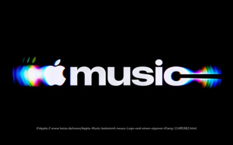
Apple Music is also brand-new, having officially unveiled its new identity on October 21. The red icon, which has been around for 13 years, is now black and white, and according to Apple, the logo was “physically shaped” by a composition by Fred again.. and NEST Acoustics. The tagline: “Just music, made visible.”
When the new icon appeared in the beta, the comments were pretty clear. Most people wanted their red back, and a few even threatened to switch to Spotify. 😅
My 2 cents:
You almost always face your first backlash, whether you go back to your roots like McLaren or start from scratch like Jaguar. People just don't like it when the things they love change.
That’s why I find what happens after the initial backlash much more exciting. And in that regard, McLaren has a much better chance than Jaguar, in my opinion. The gas station story is real, Papaya is still around, and the new branding is gradually making its way onto the cars, merchandise, and apps. So fans are quickly seeing how it all plays out in real life.
I'm betting on something similar with Apple Music: Once the icon is on all iPhones, most people will get used to it faster than they think.
Still, I take Tom Foulkes' point seriously. When fans react so strongly, it's rarely just about a font. Often, there's an underlying concern that something about the brand itself is changing.
What does that mean for your rebranding?
You're not McLaren, and your customers probably won't leave comments under your new logo. But they'll still react—especially those who've been working with you for a while or buying your products.
✅ Help tell the story. A new logo without an explanation can quickly seem arbitrary. For McLaren, it’s their parents’ gas station; for you, it could be your first store, your first product, or the reason you started your business in the first place.
✅ Keep something that makes people recognize you. Bei McLaren ist das Papaya, bei dir vielleicht eine Farbe, ein Claim oder dein Bildstil.
✅ Show off the new branding in action right away. A logo on a white background always looks a little bare. It looks completely different on the product, in the store, or on the website.
✅ Tell your existing customers first. They should hear it from you before they see it anywhere else.
✅ Stick it out for the first two weeks. A negative reaction doesn't necessarily mean your rebranding is a failure.
So there’s almost always some grumbling whenever something changes. The key is whether your story can withstand it. Have you ever done a rebranding yourself and faced some pushback? Tell me about it—I’m curious!
Stay bullish 🔥
Chantalle
P.S. Are you thinking about refreshing your branding right now and aren't sure what to keep and what to get rid of? Just reply to this email, and we'll take a look at it together. ✉️ chantalle@boredbrands.studio
