Your writing says more about you than you think.
Hey Brand fan,
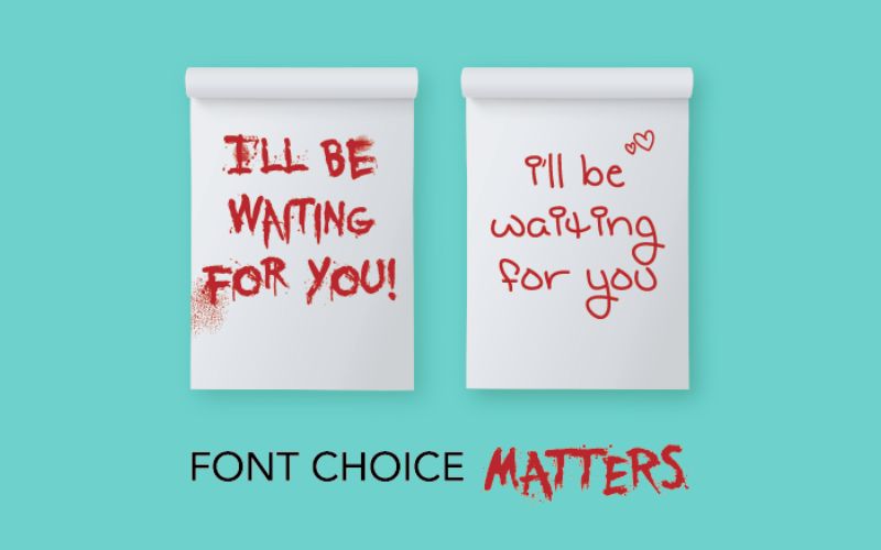
A product looks exciting at first glance - but something feels off.
Often it's not the colors. Not the photo. It's the font.
Because typography is not just typography. And it's not just relevant for designers 😉
It is mood. Target group code. Trust factor.
And what's more:
Our brain processes writing emotionally faster than it processes content.
Even before we read, we feel whether something suits us - or not.

🧠 Why this is the case:
- Fonts have "body" - they appear modern, playful, serious, loud or delicate
- Every industry has its own typographic codes - often learned unconsciously
- Even small differences trigger completely different emotions
An example:
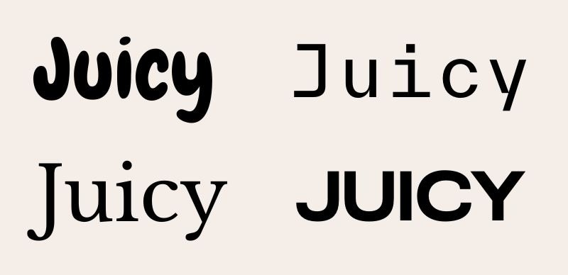
Futura Bold can look edgy and stylish - but also like an old insurance company.
Serif fonts can come across as high-class and intellectual - or like an invitation to a wedding.
Context decides. And: target group.

🛍 Example from practice:
Imagine you sell skincare.
Your USP: vegan, clinically clean, for sensitive skin.
👉 Then you shouldn't go for a playful brush script - but a clean, gentle, calm typography with air and cleanliness.
Or: You launch a food start-up that is young, loud & juicy.
👉Then let it bang. Big, bold headline typo. Character. Contrast.
The writing defines the pitch before you have written a sentence.

❌ Common errors:
🙅♀️ Fonts that do not fit the target group ("Because it looks nice")
🙅♀️ Too many fonts → looks chaotic & unprofessional
🙅♀️ Typo that is no longer legible in small letters
🙅♀️ "Fancy" headlines without function - or with too much of a "design student vibe"
💬 What you can take with you:
✨ Fonts have an emotional impact - not just visually
✨ Your typography is voice and invitation in one
✨ Invest time in the selection - it's one of the most important branding factors
✨ The more clearly you know how you want to come across, the easier it is to find the right typography
🏁 Conclusion
Typography is not an add-on.
It is part of your brand identity.
And it decides:
Does someone feel picked up - or wrongly addressed?
So: Read your own brand like a stranger.
Does your writing really speak the language you want to show?
Until next week - stay readable, stay coherent, stay you.
Chantalle


