


FROM THE ONLINE STORE TO THE SHELF – WHAT'S CHANGING IN BRANDING
Hey there!
Your brand is online. Now you want to expand into retail.
DM, Rossmann, Edeka. Sounds like growth.
But what about your packaging? It'll get lost on the shelf.
THE DIFFERENCE:
E-commerce:
You have a website. Videos. Testimonials. Reviews. A 5-second attention span.
The packaging is part of the unboxing experience. A nice-to-have.
Retail:
You have 3 seconds. In the aisle. Among 50 other products.
The packaging has to do it all. All by itself.
No video. No reviews. Just: packaging.

CHALLENGE #1: PACKAGING NEEDS TO WORK HARDER
Online, you tell your story through:
- Website Copy
- Product Videos
- Customer Reviews
- Social Proof
In retail? Packaging = your complete brand story.
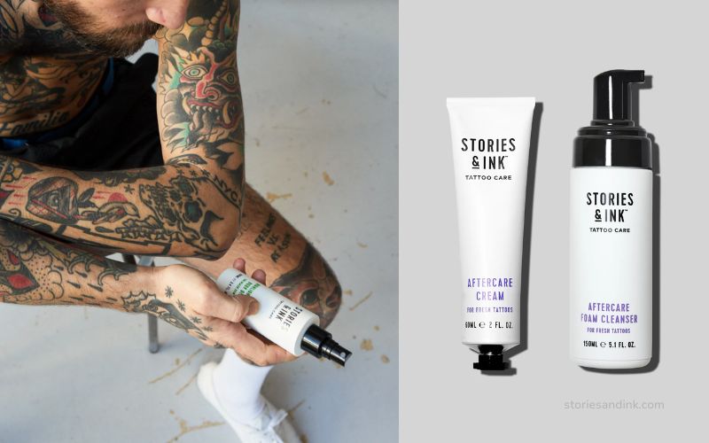
Example: Stories & Ink (Tattoo Skincare).
Started as a DTC brand. Then: Target (U.S.) + Superdrug (U.K.).
What did they have to change?
→ Product imagery directly on the packaging (consumers want to see what’s inside)
→ Clearer communication of benefits (no need for a website to explain)
→ Shelf-ready design (must stand out among competitors)
The designer said: "Without an engaging website to highlight features and tell the story, the packaging has to do all the heavy lifting on its own."
CHALLENGE #2: THUMBNAIL VS. SHELF PRESENCE
Online:
Your packaging is viewed as a thumbnail. Small. On a cell phone.
It should work at 300x300px.
Retail:
Your packaging is on the shelf. Right next to your competitors.
It must be visible from a distance of 3 meters.
The problem:
Many brands design for online—and forget that retail requires a physical presence.
What works:
- Bold typography (easy to read from a distance)
- High Contrast (stands out on the shelf)
- Clear Hierarchy (Consumers understand what you are in 3 seconds)
CHALLENGE #3: CONSISTENCY WITHOUT CONFUSION
The trap:
You have an online brand. Now you’re moving into retail.
If your retail packaging looks too different, customers won’t recognize you. If it looks too similar, it won’t stand out on the shelf.
The solution:
Same brand DNA, different execution.
→ Same colors, fonts, and tone
→ But: customized layouts for retail (more information, clearer hierarchy)
Brands with consistent branding across all channels grow 23% faster (Forbes).
But consistency ≠ copy-paste.
HOW TO COMBINE THE TWO:
1. Design for the medium, not just for the brand
→ E-commerce: Thumbnail-optimized, unboxing-focused, digital storytelling
→ Retail: Shelf-optimized, benefit-driven, instant recognition
2. Use packaging as a bridge
→ QR codes on retail packaging (link to your website/community)
→ "Follow us @..." on the packaging (retail customers become online fans)
3. Test your design in both worlds
→ Print out your packaging. Place it among your competitors’ designs.
→ Open it as a thumbnail on your phone.
→ Do both work? Go.

SELF-CHECK:
✅ Does my packaging tell the whole story—even without a website?
✅ Does my design work as a thumbnail AND on the shelf?
✅ Is my brand consistent but optimized for each channel?
✅ Do I have retail-specific elements (shelf presence, clear hierarchy)?
My two cents
E-commerce and retail are two different ballgames.
Online, you can explain things. In retail, you have to convince people right away.
Your packaging isn't just protection. It's your silent salesperson. 🔥
And if it doesn't stand out on the shelf—you've lost before the customer has even seen you.
See you next week – design for the channel, not just the brand.
Chantalle
P.S. – If you’re currently expanding from e-commerce into retail: Let’s talk about your packaging. A redesign now will save you thousands in lost sales later. ✉️ chantalle@boredbrands.studio
