


If your packaging doesn't sell - your product won't sell either.
Hey Brand fan,
The best product is useless if it is not understood.
Especially on the supermarket shelf, it takes seconds to decide whether someone grabs it - or scrolls on, er... leaves. On social media, you get stuck on the first look - and that is also the external appearance.
And no - this is not because people are inattentive.
It's because our brain subconsciously scans whether something is relevant to us.
What does that mean for you?
Your packaging doesn't just have to stand out - it has to trigger a clear feeling:
✔️ I know that.
✔️ That appeals to me.
✔️ That looks delicious, I want to try it.

😬 Common errors:
Many startups (and unfortunately also big brands) fall into the same trap again and again:
🙅♀️ Design without appetite
Especially with food: beautiful, but not snackable.
Images that don't make you hungry - colors that trigger art rather than the impulse to buy.
🙅♀️ Variety & USP not visible
If it takes me five seconds to find out what it's all about - the product is already lost.
🙅♀️ Branding too shy
Logo too small, font too clean, message too cryptic.
Your brand needs to show attitude - not hide.
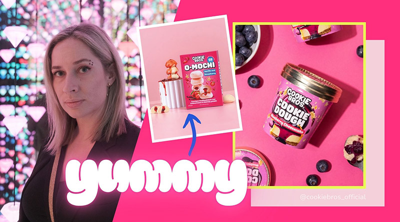
🍪 Example: Cookie Bros
At Cookie Bros, we redesigned the packaging - from the ground up.
Not because it was bad. But because it wasn't loud enough in the chiller cabinet. And it didn't have that yummy factor that tempts you to try something sweet simply because you can almost taste it.
Today you can see:
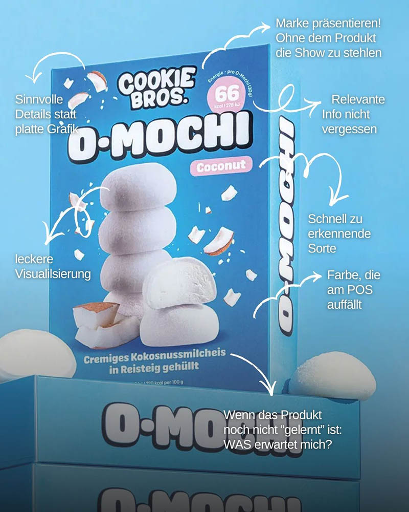
💥 Large, emotional product photos (AI-generated - but with knowledge!)
💥 Each variety has its own color - for quick orientation
💥 The brand is visibly in the foreground - but does not distract from the product
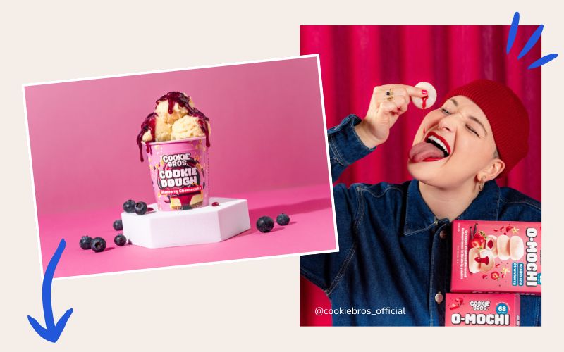
The reaction?
"Wow, that looks delicious!" - Not: "Oh, cool job."
And that's exactly the point.
🧠 Advertising psychology in brief
Our brain loves two things:
🔁 Recognition & 💡 Clarity.
If packaging appears familiar and emotionally triggering, the likelihood of a purchase increases significantly.
This is the so-called "fluency effect":
The easier a packaging design is to process - visually & in terms of content - the better it feels. This is especially true for impulse purchases.
🎯 What you can take away from this
Good packaging is no coincidence - it is psychology in color and form.
✨ It has to have a quick impact, appeal emotionally and make people want more.
✨ Even small elements such as a seasonal tape, a cheeky slogan or an eye-catching sticker create brand loyalty and product identity.
Because first impressions count.
And with food, this is made directly through the eyes - not through rational arguments.
🏁 Conclusion
Design can be cool - but it also has to sell.
If your packaging is only beautiful, but doesn't leave a feeling:
Then your product will be overlooked.
So:
Don't just look at trends.
And ask yourself: Would I blindly pull this off the shelf without thinking about it?
See you next week - stay snackable, stay clear, stay you.
Chantalle
