


What a good logo must be able to do - and why just one is not enough
Hey, brand makers,
There are logos that everyone knows. Apple. Nike. Louis Vuitton. And then there are those that disappear somewhere in the nirvana of irrelevant designs.
Why? Because a strong logo is more than just "beautiful". It has to work everywhere, on the smallest screens as well as on a house wall. And - spoiler - you don't just need a logo.

1. your logo is not a work of art, but a tool
Many companies overload their logo with details because they think: "That shows exactly what we do!" The problem? The more there is, the worse it works in small sizes or on different backgrounds.
Example: Apple, Nike or Chanel - their logos are iconic because they are simple and recognizable. No superfluous details.
Tip: Imagine your logo has to be recognizable as an Instagram profile picture in 16x16 pixels. If it doesn't work there, it's too complicated.

2. logos for different purposes - one is not enough
Logos have to adapt - to packaging, social media, merchandise or the website. That's why successful brands use different versions:
Main logo: Your key visual - the full version for everything where there is space.
Secondary logo: A compact version if the main logo is too large.
Icon or monogram: Perfect for social media, apps or merch.
Example: Starbucks has understood this. It used to have "Starbucks Coffee" around the logo - today the mermaid is completely sufficient.
Tip: Do the test: Does your logo work just as well in an Instagram feed as on a billboard? If not, you need a smart version.
3. your logo must work everywhere - from black and white to animated
Logos are no longer static elements. They appear everywhere - digitally, in print, as embroidery on merchandise or as animated versions in videos.
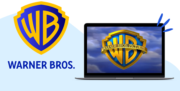
Example: Warner Bros. redesigned its logo in 2023 - it works as a simple icon, as a wordmark or as an animated version for the screen.
Check your logo for these points:
✅ Does it work in black and white? Colors can be omitted - your logo must still be legible.
✅ Is it scalable? A logo that looks great on a truck advertisement must also work on a ballpoint pen.
✅ Can it be animated? More and more brands are relying on animated logos - Google, Airbnb and Nike have shown the way.
4. please don't put everything in the logo - you don't need a coffee cup icon just because you sell coffee
Many people think that their logo must have a visual connection to the business. So: bakery? Then a pretzel please. Fitness studio? A dumbbell. But look at the strongest brands in the world:
🚫 Apple didn't sell an apple.
🚫 Nike doesn't have a shoe in its logo.
🚫 Mercedes doesn't show a car.
Why is that? Because a logo represents a brand - not the product range.

🎯 Expert tip from Xenia, Art Director at BoredBrands Studio
"Honestly? Most logos are completely overloaded. Every time someone says: 'We need another crown because we're premium' or 'Can we add a feather because we want to look light?", a designer somewhere dies inside. 🥲 A good logo is simple, it's immediately memorable and can be used anywhere. That's all it needs."

What a good logo must be able to do: Simply Solid shows how it's done 🧼
A strong logo is more than just a pretty design - it's a flexible trademark. Simply Solid shows how: Your primary logo is clear, memorable and versatile.
Particularly clever: the "O" in the logo becomes an independent figurative mark, which is just as effective embossed on the products as it is in print. In addition, the design repeatedly picks up on the characteristic shape of the solids, which strengthens the brand's recognizability at all levels. The logo thus becomes the connecting element of product, packaging and brand identity.
The bottom line:
A good logo is simple, flexible and timeless. It should work everywhere - from social media to the company façade. And the best thing? You don't just need a single logo, but clever variations that adapt to different purposes.
See you soon, stay minimalist and striking,
Chantalle
