

Your best logo might not even need an image. Just letters that belong to no one else.
Hey Brand fan,
The world's most powerful logos don't tell you what the company actually does. And quite a few of them don't even have an image in them. Just the name, in a font that no one else uses.
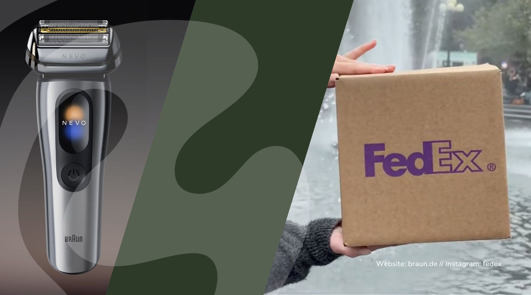
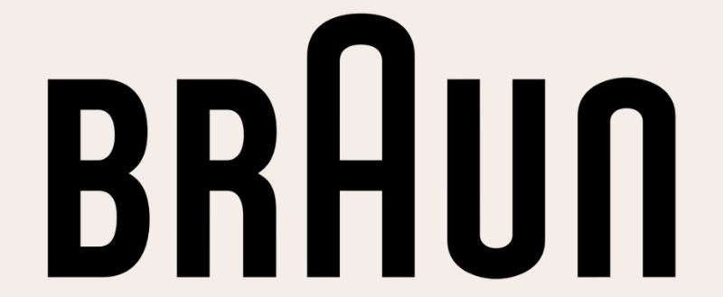
Braun. FedEx. Sony. No symbol, no icon, no bean, no lightning bolt. And yet you still recognize them out of the corner of your eye.
This is called a wordmark—a logo made up entirely of typography. It sounds like the most boring logo choice ever. In reality, it’s one of the boldest. Today, we’ll explore why it works so well, what the price range is, and why trends are your worst guide when it comes to this.
Fun Fact:
The Braun logo with the raised "A" has been around in its core form since 1934. The simplified version, which is still in use today, was introduced in 1952 (Source: Logo Design Love / Sight Unseen). Since then, it has undergone only minor adjustments, but has never been altered.
Dieter Rams shaped Braun as its head of design from 1961 to 1995, with a phrase you can hang above your bed: “Less, but better.” (Source: Vitsœ / V&A)
And that’s exactly the point. Even 70 years later, this wordmark still looks modern because it never tried to be modern. No gradients, no 3D, no frills that scream “that era.” Letters age more slowly than effects. Always.
In Braun's case, this appeals precisely to the target audience that appreciates engineering excellence and understated design. A playful, image-based logo would immediately come across as cheap.
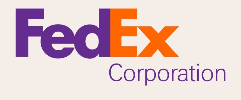
Second example—and my favorite illustration of how a word mark can still be clever: FedEx.
Designed in 1994 by Lindon Leader at Landor (Source: Landor / CNN). The typeface is a custom font—a blend of Futura and Univers—created specifically for the brand. That means these letters really belong only to FedEx; no one can just download them.
And then there’s the trick that probably half of your readers have never noticed: there’s a white arrow between the E and the x. Speed, precision, direction. Over 40 design awards for this one detail (Source: ArtCenter / Rolling Stone, 2003).
Only about 20% of people...
discover the arrow on their own (Source: BusinessAnywhere). So the real win isn't the hidden arrow at all. It's their own letters. The extra is the cherry on top, not the baseline.
And now for the part that’s really close to my heart. The reason why I’m so averse to trends at Logos.
Over the past ten years, it feels like everyone has done the same thing: flattened their logos, stripped out the flourishes, and switched everything to the same safe sans-serif font. Airbnb in 2014, Google in 2015, Pinterest in 2017, Saint Laurent, and most recently PayPal in 2024.
The design world even has a name for it: “Blanding.” Branding becomes bland.
Sounds good. The problem is: When everyone chases the same trend at the same time, everyone ends up looking the same. And a brand that looks like ten others isn't a brand anymore.
And here comes the bill. In August 2025, Cracker Barrel replaced its old “Old Timer” logo with a clean word mark. The result: fierce backlash, nearly $100 million in market value lost, and the old logo was back within a week (Source: CNN / Forbes, 2025). They had discarded the one distinctive element that people recognized them by.
My 2 cents:
A word mark is only an asset if it belongs to YOU. If you just copy the trend, you’ll fade into the background. And yes, you don’t have to throw away your logo tomorrow because of this—you can handle it without panicking. But “it looks modern right now” is the worst possible reason for choosing a logo.
Just so this doesn't sound like "a typo logo is always the solution": It comes at a price. And Zara illustrates that quite starkly.
In 2019, Zara had its logo redesigned by the agency Baron & Baron. The letters were squeezed together so tightly that they overlap (Source: Dezeen, 2019). Typographer Erik Spiekermann publicly called it “the worst piece of typography I’ve seen in years” (Source: Designboom, 2019).
Why this is instructive: With a word mark, the typeface IS the product. There’s no symbol you can hide behind. If you sacrifice readability for a cool look, the whole logo falls apart.
So, honestly, the trade-offs to consider when thinking about "Typo-Only":
✅ You need a typeface with its own character. Pick a random Google font, and you'll end up in a sea of blandness. And yes, sometimes it's worth spending a few euros on a font. Otherwise, you're cutting corners in the wrong place.
✅ Text alone won't give you an icon for mini touchpoints—like the app icon, favicon, or Instagram profile picture. Often, you'll still need an abbreviation or monogram to go with it.
✅ A word mark conveys no visual meaning on its own. Recognition comes only through repetition and time. Braun had 70 years. Your startup doesn't have that, and that's okay, but you need to be aware of it.
✅ Readability is non-negotiable. See Zara.
Bottom line: A good logo doesn’t have to show what you do. And the best ones often get by with no imagery at all. But a typography-only logo isn’t a shortcut to “clean and done.” It’s a statement that you’re willing to invest in your own typeface and in years of consistency.
If that's not you, an image element is perfectly acceptable. If it is you, you have an asset that will stand the test of time.
Stay bullish 🔥
Chantalle
P.S. Not sure if your word mark is effective or just trendy? Just reply to this email with your logo, and I'll give you my honest opinion on what I see. ✉️ chantalle@boredbrands.studio
